Bradham’s Dilemma

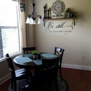
When I first meet with the Bradham family they originally were wanting my opinion on wall color. But once we got to talking it was clear that the walls weren’t the problem. They had collected furniture and decor during their marriage, which was all in the brown family, but the home they moved into two years ago had grey and white tile, white kitchen cabinets, and grey walls. So nothing was jelling. Since the walls were freshly painted and the furniture was old, I asked “Why don’t we put your money where it’s going to make the largest impact and keep things fresh for years to come?”  It was clear to me that we could really turn their home into the dream space they had always wanted without paint, cabinetry, and flooring.

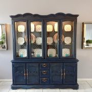
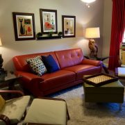
The result…a chic, industrial mash up! Nicole and Jeff were great to work with. They knew what they didn’t like and that always makes my job a lot easier. After some digging I was able to come up with a pallet that would work wonderfully with the grey backdrop while adding some colors that they really loved…teal, orange, and navy.  My favorite piece is that navy china hutch with copper plates and teal cups.

Thank you Bradhams for allowing me to serve your family and forgiving me freedom to give you something unique. It was a true honor and I look forward to working with you in the future.

Perlewitz Paradise

When Sandy Perlewitz contacted us about updating their home, I instantly liked her and knew she was going to be a joy to work with. Well, I was right. Sandy is kind, generous, loving, full of faith, and just the kind of person you want to keep in your circle of friends. What I loved about Sandy was the struggle she wrestled with in spending money on herself, her house.  After giving her the proposal she sat on it for a month or two and decided that the numbers needed to come down for her to have a peace about the project. I love that about her. She is thoughtful about the resources that God has given her and she wanted to make sure that before she spent it on herself, He needed to give her a peace about it. I know she bathed the decision in prayer and council. This made the project all the more special. I knew this was a family that rarely spends money on their own comforts and this was a big deal that she was taking this leap with us. We were honored.

Sandy’s house was modestly decorated. Nothing flashy, formal, or overly pricey.  Since moving into their home a few years back, Sandy was never really in love with the overall feel of the house. That’s why she called us. Keeping all the existing furniture she just needed help with paint colors and finishes. Shopping for the Perlewitz family was so much fun because I knew they were going to be grateful with whatever we came up with. I was right. When Sandy walked through the finished product, she looked like she didn’t know what to say but wanted to shed tears out of thankfulness.

Sandy and Tim, I want you to know how GRATEFUL we are that we got to serve your family in this way, giving you the house of your dreams, a place you love coming home to, a place you can serve God and serve your family and friends. You guys are one of a kind and we are so thankful to know you.


untitled

Clermont Transplant

Charles and Gayle Beck moved to Clermont from Maryland a few months ago and they brought nearly nothing with them. By nothing I mean they were sleeping on air mattresses and sitting on lawn furniture. They wanted a fresh start to kick off retirement and they called us to help them make their new home the Florida home they had been dreaming of. Their new home is located on a beautiful lot in a well-maintained neighborhood located on a golf course. The Beck’s have great taste and were willing to spend more to get great pieces of furniture to withstand the test of time. We selected beautiful, solid pieces from Ethan Allen and La-Z-Boy for their main pieces. Pier1 and Homegoods had some great finds on some solid wood coffee tables, buffets, and end tables. The family had only three pieces of furniture that had been passed down as family heirlooms…a dining room set, entry table, and china cabinet, all really beautiful pieces that had great bones. The Beck’s were so fun and easy to work with which made this project even more special. It’s always fun to help transplants feel welcome by making their home a place they want to put roots down. Thank you, Charles and Gayle, for trusting us with your new home! We have thoroughly enjoyed working with and for you.

Check out the before to get the full effect!


Mid-Century Modern Flair

Billie Williams came to us from a friend’s recommendation. She knew what she liked–funky, unique 70s pieces mixed with mid-century modern flair. Billie just had a hard time making big decisions and pulling it all together. Of course we were happy to help. This was such a fun project to work on. Billie loves color and wanted her main living spaces to reflect that. Some family heirloom pieces were mixed in too– and we think the end result is totally groovy! 

The Hill Family of Seven

The Hills have one incredible family of seven. Their house was full of love and casual comfort but lacked a bit of cohesiveness. With a frugal budget and using a lot of her existing pieces and accessories, I was so thrilled to give this home a little love. Kate’s style is truly eclectic. She’s not afraid of color so I went with navy, gray blues and coral. Antiques were mixed with modern pops of whimsy all surrounded by causal family sayings and pictures. We even used some of the kids framed artwork. It is evident walking throughout their home where their priorities are and what a lovely family this is.  Best part is I gained a new friend!

Thanks Kate for trusting me to bring out your style. Thanks Craig for jumping on board and being such a team player.


Mermaids, Pirates, and French Provincial

Mermaids, Pirates, and French Provincial! What could these three things have in common? Siblings! The Sampson home phase two was so much fun I was sad to see it finished. The three children, ranging in ages from 4 to 16, already had great furniture, Pottery Barn! Our job was to finish it off with accessories, artwork, curtains, pillows, and lamps. I think each room turned out great and each has it’s own unique spin. THANK YOU Sampson’s for allowing me to, once again, be trusted with your home.

Total Redo: Sams and Hensley

I love when the conversation starts with total REDO!

Gutting the kitchen, new floors, removing wallpaper and mirrored walls, even totally redoing the exterior…you name it we did it to the David Sams/Taylor Hensley home.

After many Pinterest finds that I had Taylor find so I could pinpoint their tastes, I knew exactly where to head.  Plumbing, light fixtures and hardware were edgy and modern so after the “Joanna Gaines” type décor, things would remain young and sleek. 

Rustic yet sleek was the overall idea as we really nailed that with the kitchen redo, pallet wall and master bath tile design.

David and Taylor let me run with everything knowing that I had the décor and the finishing details in mind during the renovations. This is when a home run is formed with I get my hands on the details from the ground up 🙂

 Now onto the nursery….yes they are expecting….the office, pool bath and upstairs bonus room (well it’s way more than a room and more like another house upstairs!)

David and Taylor, let’s continue the fun!!!

The Sampson Compromise

She loves Joanna Gaines from Fixer Upper. He loves Restoration Hardware. These two styles are not completely at separate ends of the spectrum but enough to keep me on my toes, which I love. It is so fun to mix two worlds! It’s even more fun to see the look on the faces of the homeowners when they see their two styles living in perfect harmony.  Projects like the Sampson home remind me that there are MANY ways to decorate a home and mixing two styles, often gives the perfect style.


Britt’s North Lakeland Southern Paradise

It never gets old…helping people make the home they have lived in for years, have life again. The Britt’s have a beautiful North Lakeland home but it needed some love. Over a the course of several months we transformed their cozy home into an over the top southern paradise. Teal, soft ivory, gray and mustard became the pallet. Touches of industrial accessories, shabby chic furniture, and old mixed with new items, helped pull together the over all feel.  It has been a pleasure to work with the Britt’s! It feels good when someone trust you completely with their most protected space, their home. 

Cotterill’s Fresh Start

Donna Cotterill is not only a driven and successful business woman but she is a single mom looking to make a fresh start for her and her daughter in 2016. When she came to me we dreamed about what her newly built Ernie White house could be.  So this project was especially rewarding as I got to see every single detail of the process come to fruition and then finally decorated and handed over to Donna and her daughter. Thank you Donna for trusting me with your home. Sad to see it end!


Hodge Part 2 – Bedrooms

What can we say about the Hodge family that we haven’t already said the first Hodge blog? They are wonderful. We wish every project would go as smooth as both Hodge projects went. Can’t help but wonder if it went so smooth because the Hodges are such a pleasure to work for and with.  In keeping with the essences of who this family is, we used touches of country mixed with touches of class. One of our favorite things to do is mix two design worlds and this was a fun project for that reason. Hope you love the outcome as much as we do!


Hyde Park Staging

Staging is a great way to sell your home quickly. The idea is to give the empty house a “lived-in” feel so that buyers can image settling in and nesting.  This Hyde Park staging project was a great house with great bones. It was such a pleasure to take this already beautiful home and give it a boost with our staging inventory. We look forward to many more opportunities at making an empty house look like a cozy home.


Hodge Remodel

Decorating the Hodge home can be summed up with one word…FUN! Taree Hodge, wife and mother of 4, was up for anything. It’s always nice to work with people that trust the process and believe in your craft. Taree was such a delight and was always agreeable and upbeat about all aspects of the journey.

First came the ultimate remodel.  I had Taree select some inspiration pictures from Houzz.com of kitchens and rooms that she was drawn to.  I helped her put those dream images to real life by selecting painted/glazed cabinets, cambria countertops, new appliances and a travertine backsplash to add warmth and texture.  Also added a pantry/buffet in the nook for more usable cabinet space that also served as a built-in buffet for entertainment.  Vinyl plank floors were the perfect choice to secure that welcoming touch of wood but intense durability.  A variety of muddy teal paints were bounced throughout the spaces to bring cohesiveness to all of these open spaces.  Medium oak vinyl plank “wood looking” floors were selected to tie in the décor that was soon to be.

I did an inspiration palette and let Amanda run wild with her creativity.

Kristina Jesse, Designer

At first glance, it’s clear that the Hodge family loves hunting, country living, and family. Taree wanted to make sure that her house wasn’t stuffy but rather welcoming to the grandkids and extended family. She wanted a space that was cozy, soft, and rustic.  All the main living spaces were getting a facelift and our pallet was light blues, soft creams, and neutral browns.  We started with an amazing rug found at Wayfair that really brought the living room together and set the tone for the whole house. The “Man Cave”, complete with deer heads and other , was brought together with a bold rug and a lodge style window treatment.  The rich colors and rustic elements, like antler lamps and tree branch candles, really gave this room a balance of masculinity and style.

When you get to know Taree, you really can’t help but like her. She is sweet and kind; someone we truly wanted to bless. We were thrilled she walked in to see her new home and was speechless. It was such a great privilege to serve Taree and her family in this way. It never gets old helping people to make their house, their home!

Amanda Bass, Assistant Designer

Vintage Victorian Nursery

Late night feedings can feel like purgatory!  You stumble in the dark, half conscience, to find the crying baby, you change and feed the baby and pray that they go back to sleep, and you cry a little in between because you are so sleep deprived.  Yes, I remember those days well. What helped make those nights seem bearable was a clean, well organized, and peaceful nursery, a place I actually enjoyed going to.

When the Jarrell family approached us about decorating their nursery for their soon to arrive fourth child, I was so excited. As a mother of two I know how much time baby and mamma spend in the nursery. It was almost like taking a walk down memory lane as I planned and dreamed about what the room could be.

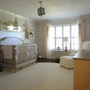
Melissa Jarrell has a very classy and sophisticated style with a touch of vintage Victorian.  She had a crib already picked out from Restoration Hardware which became our inspiration. Peaches and creams were scattered everywhere including a dramatic silk window treatment, my favorite thing in the room, which tied everything together. The floor was grounded with a huge 10′ braided cream rug from Joss and Main.  The walls displayed beautiful shadow boxes made from old frames, which displayed trinkets and soft touches of peach accents.  The rocker, our splurge item for obvious reasons, was surprisingly from Baby’s R Us. The soft linen fabric was perfect and exactly what I was looking for as an accent fabric. We were completely wowed at the quality and style of this glider and highly recommend it to anyone in the market for nursery furniture.

It was such an honor to decorate this nursery for this sweet family. I hope the Jarrell’s enjoy their new space and find it calming on those late nights and early mornings.

Amanda Bass,
Assistant Decorator


Jarrell Master Suite…West Indies Resort

West Indies Resort….AKA the Jarrells’ lovely master suite.

Jon found me online.

Got off the phone and told my hubby, Chris, “Gosh that’s such a nice man”.  Little did I know he had a nice wife too!

When I first met them I spent hours walking through their LOVELY home in a cul-de-sac near Scott Lake.  We all spilled our ideas and dreams for a multitude of face lifts/renovations that would soon be broken up into phases.

I quickly realized this family was special….grounded in faith….spending time where it counts….making memories and doing life together.  Jon and Missy didn’t know it yet, but I was THRILLED to have the opportunity to help them tweak this home.

Their current style reflects an eclectic mix of time worn leathers, British Colonial flairs, simple linens and smoky teal blues.  Hearing about some of their pieces makes me know they hold tight to memories and want their home to be a true reflection of their family.

Their home was built in the 70’s and was tastefully done in its time.  Past down from the family, the Jarrell’s wanted to make it their own.  We dreamed of white 12″ tile being replaced with just the right wood floor, gutting the kitchen, new furniture layouts, a mudroom with all the backpack and shoe cubbies a family could dream of and of course the upstairs master suite.  We started there.

Phase 1- upstairs master suite;  sitting room, bedroom and bath

We replaced the carpet with the most stunning aged wood with random plank sizes for interest.  Just the right shade, their wood floors really complimented their white coastal inspired furniture.  After seeing some of their existing antique pieces but knowing they wanted a more clean, modern feel, I used the Jarrell’s existing navy/coral pillows as my inspiration.  I felt it brought the timeless sophistication, but kept things clean, bold and simple.  An inspiration had been born.

I choose a super soft teal gray “Gray Owl” by Benj. Moore to add a kiss of cool serenity to all of the warm tones which was soon to be. Actually the Jarrell’s came up with this color after my choice went just a hair bolder.  I loved it!

My first purchase was the two-toned gauzy drapery panels as I could just see the windows open and these panels blowing in this high end resort.  It had just the right two-tones of ecru that I wanted to bounce around the room.  The bedding was calming, yet inviting and I chose a glue/gray for the sheets.  A multitude of textures and wood tones make this space feel intriguing, exotic and calming.  A time-worn putty/gray vintage rug grounded this space.

The bathroom….oh the bathroom!  I just love how this turned out.  We replaced the old ornate cream lighting fixtures with new one from Fergusons.  Added hardware to the cabinets for interest.  Bubble baths will never be the same in here….especially with that palm print over the tub.  They even have a place to hang their towels now 😉

Missy and Jon.
A master suite is one of the most private spaces, yet you opened it up to me.  My sincere hope is that you both experience restful tranquility in your new space, providing you the zeal for life, for marriage, for family.

It’s truly “more than décor”.

Thanks guys.

HUGE shout-out to Bunch Construction who handled the painting, flooring and larger base boards. Great work, guys!