Hodge Part 2 – Bedrooms

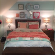
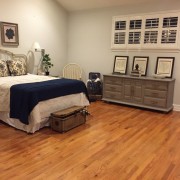
What can we say about the Hodge family that we haven’t already said the first Hodge blog? They are wonderful. We wish every project would go as smooth as both Hodge projects went. Can’t help but wonder if it went so smooth because the Hodges are such a pleasure to work for and with.  In keeping with the essences of who this family is, we used touches of country mixed with touches of class. One of our favorite things to do is mix two design worlds and this was a fun project for that reason. Hope you love the outcome as much as we do!


Hyde Park Staging

Staging is a great way to sell your home quickly. The idea is to give the empty house a “lived-in” feel so that buyers can image settling in and nesting.  This Hyde Park staging project was a great house with great bones. It was such a pleasure to take this already beautiful home and give it a boost with our staging inventory. We look forward to many more opportunities at making an empty house look like a cozy home.


Hodge Remodel

Decorating the Hodge home can be summed up with one word…FUN! Taree Hodge, wife and mother of 4, was up for anything. It’s always nice to work with people that trust the process and believe in your craft. Taree was such a delight and was always agreeable and upbeat about all aspects of the journey.

First came the ultimate remodel.  I had Taree select some inspiration pictures from Houzz.com of kitchens and rooms that she was drawn to.  I helped her put those dream images to real life by selecting painted/glazed cabinets, cambria countertops, new appliances and a travertine backsplash to add warmth and texture.  Also added a pantry/buffet in the nook for more usable cabinet space that also served as a built-in buffet for entertainment.  Vinyl plank floors were the perfect choice to secure that welcoming touch of wood but intense durability.  A variety of muddy teal paints were bounced throughout the spaces to bring cohesiveness to all of these open spaces.  Medium oak vinyl plank “wood looking” floors were selected to tie in the décor that was soon to be.

I did an inspiration palette and let Amanda run wild with her creativity.

Kristina Jesse, Designer

At first glance, it’s clear that the Hodge family loves hunting, country living, and family. Taree wanted to make sure that her house wasn’t stuffy but rather welcoming to the grandkids and extended family. She wanted a space that was cozy, soft, and rustic.  All the main living spaces were getting a facelift and our pallet was light blues, soft creams, and neutral browns.  We started with an amazing rug found at Wayfair that really brought the living room together and set the tone for the whole house. The “Man Cave”, complete with deer heads and other , was brought together with a bold rug and a lodge style window treatment.  The rich colors and rustic elements, like antler lamps and tree branch candles, really gave this room a balance of masculinity and style.

When you get to know Taree, you really can’t help but like her. She is sweet and kind; someone we truly wanted to bless. We were thrilled she walked in to see her new home and was speechless. It was such a great privilege to serve Taree and her family in this way. It never gets old helping people to make their house, their home!

Amanda Bass, Assistant Designer

Vintage Victorian Nursery

Late night feedings can feel like purgatory!  You stumble in the dark, half conscience, to find the crying baby, you change and feed the baby and pray that they go back to sleep, and you cry a little in between because you are so sleep deprived.  Yes, I remember those days well. What helped make those nights seem bearable was a clean, well organized, and peaceful nursery, a place I actually enjoyed going to.

When the Jarrell family approached us about decorating their nursery for their soon to arrive fourth child, I was so excited. As a mother of two I know how much time baby and mamma spend in the nursery. It was almost like taking a walk down memory lane as I planned and dreamed about what the room could be.

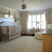
Melissa Jarrell has a very classy and sophisticated style with a touch of vintage Victorian.  She had a crib already picked out from Restoration Hardware which became our inspiration. Peaches and creams were scattered everywhere including a dramatic silk window treatment, my favorite thing in the room, which tied everything together. The floor was grounded with a huge 10′ braided cream rug from Joss and Main.  The walls displayed beautiful shadow boxes made from old frames, which displayed trinkets and soft touches of peach accents.  The rocker, our splurge item for obvious reasons, was surprisingly from Baby’s R Us. The soft linen fabric was perfect and exactly what I was looking for as an accent fabric. We were completely wowed at the quality and style of this glider and highly recommend it to anyone in the market for nursery furniture.

It was such an honor to decorate this nursery for this sweet family. I hope the Jarrell’s enjoy their new space and find it calming on those late nights and early mornings.

Amanda Bass,
Assistant Decorator


Parade of Homes…Urban Lodge

Urban Lodge…the “Greystone”….PCBA First Place Winner….Ernie White shines again!

Ernie White refuses to stay stagnant.

He’s known for his stately traditional home….built to perfection….lacking nothing when it comes to trim.  A classic to say the least.

With changing times comes changing décor.  Young families need to be drawn in by his ability to shift and customize based on current trends.

Because this home was to be put on the market, I was able to have full control and stretch Mr. White like he’s NEVER been stretched!  The house WON.…the buzz continues….here’s why.

-The cabinets are a muddy taupe and all the trim work is a perfect match
-A navy island base coordinates beautifully with the smoky slate back-splash
-The floors aren’t your everyday distressed hickory.  They are seamless, dark and flawless
-The 8′ doors are a straight out of a New York loft….I painted them a deeper gray/olive to add contrast against the trim and to add even more life; door hardware….well it’s just edgy
-The lines are clean, right down to the solid wainscot wall in the master and the 3/4 high wainscot in the den
-The plumbing is bold; stainless and modern
-The lighting….oh the lighting.  It’s ultra sleek; dark iron for richness
-Master baths don’t have to be feminine;  but trust me….a woman will flip over this zen-ful retreat. Dark slate, glass tile and calming Cambria ushers in serenity
-Coffered ceiling with cherry beams bring a unique skilled craftsman appeal in both the great room and dining
-The fireplace…my favorite!  Above the mantle is random sized plank wood and below is linear slate mosaic
-The built-ins beside the fireplace not only match the kitchen cabinets in color, but also in style
-The stained ceilings on the ENORMOUS back lanai with Pool Blue’s sophisticated darker pool, fully surrounded in pavers makes you not only want to entertain, but throw a huge party
-The full outdoor kitchen/grill, the pool bath, the front door, the exterior colors…….
The list goes on and on!!!!

This prized home is fully staged and ready for a family or empty nesters.

Kristina Kreations…..that’s me….owns ALL furnishings/accessories and willing to negotiate selling with the purchase of the home or future staging.

There’s something really unique about this home.  Amanda Bass say’s “it’s straight out of Colorado; something you typically don’t see in Polk County”.

I had a blast creating this home for Ernie to shine and for a future Lakelander to posses.

I’ll let the pictures do all the talking from here…..

Love ya Ernie and congrats on winning 3 first place ribbons this year!  LOVE working with you and your fantastic team :)))

It’s more than décor,
Kristina


Jarrell Master Suite…West Indies Resort

West Indies Resort….AKA the Jarrells’ lovely master suite.

Jon found me online.

Got off the phone and told my hubby, Chris, “Gosh that’s such a nice man”.  Little did I know he had a nice wife too!

When I first met them I spent hours walking through their LOVELY home in a cul-de-sac near Scott Lake.  We all spilled our ideas and dreams for a multitude of face lifts/renovations that would soon be broken up into phases.

I quickly realized this family was special….grounded in faith….spending time where it counts….making memories and doing life together.  Jon and Missy didn’t know it yet, but I was THRILLED to have the opportunity to help them tweak this home.

Their current style reflects an eclectic mix of time worn leathers, British Colonial flairs, simple linens and smoky teal blues.  Hearing about some of their pieces makes me know they hold tight to memories and want their home to be a true reflection of their family.

Their home was built in the 70’s and was tastefully done in its time.  Past down from the family, the Jarrell’s wanted to make it their own.  We dreamed of white 12″ tile being replaced with just the right wood floor, gutting the kitchen, new furniture layouts, a mudroom with all the backpack and shoe cubbies a family could dream of and of course the upstairs master suite.  We started there.

Phase 1- upstairs master suite;  sitting room, bedroom and bath

We replaced the carpet with the most stunning aged wood with random plank sizes for interest.  Just the right shade, their wood floors really complimented their white coastal inspired furniture.  After seeing some of their existing antique pieces but knowing they wanted a more clean, modern feel, I used the Jarrell’s existing navy/coral pillows as my inspiration.  I felt it brought the timeless sophistication, but kept things clean, bold and simple.  An inspiration had been born.

I choose a super soft teal gray “Gray Owl” by Benj. Moore to add a kiss of cool serenity to all of the warm tones which was soon to be. Actually the Jarrell’s came up with this color after my choice went just a hair bolder.  I loved it!

My first purchase was the two-toned gauzy drapery panels as I could just see the windows open and these panels blowing in this high end resort.  It had just the right two-tones of ecru that I wanted to bounce around the room.  The bedding was calming, yet inviting and I chose a glue/gray for the sheets.  A multitude of textures and wood tones make this space feel intriguing, exotic and calming.  A time-worn putty/gray vintage rug grounded this space.

The bathroom….oh the bathroom!  I just love how this turned out.  We replaced the old ornate cream lighting fixtures with new one from Fergusons.  Added hardware to the cabinets for interest.  Bubble baths will never be the same in here….especially with that palm print over the tub.  They even have a place to hang their towels now 😉

Missy and Jon.
A master suite is one of the most private spaces, yet you opened it up to me.  My sincere hope is that you both experience restful tranquility in your new space, providing you the zeal for life, for marriage, for family.

It’s truly “more than décor”.

Thanks guys.

HUGE shout-out to Bunch Construction who handled the painting, flooring and larger base boards. Great work, guys!


Casey and Rebekah Clark…All Things New

New baby…..new house….new décor.

Rebekah and Casey Clark were no different than most of us starting out.  They moved in a new home last November and while their home was perfect, it still lacked that “homey” feeling.  Walls were completely bare and furniture was sparse.  Kristina Kreations was on it……”mission possible”.

Truly a blank canvas, Amanda and I really honed in on Rebekah’s style since we had little to go by.  We quickly realized she was FULL of ideas and a unique and fun style that we could easily run with.

This home could be described as a shabby/rustic.  The well-known French inspired shabby chic took a back place here as the heftier, more masculine pieces took center stage;  plank wood art, hand painted buffets and a farm table (which the Clarks previously had built themselves).  Surrounded by soft grays, buttercream and a variety of teals, this home had a nice balance of casual country charm all while keeping the patterns youthful and current for this young family.

Rebekah and Casey, enjoy and grow in this home.  Thank you for trusting us to dive into your style and run with it.


Lynette Walker-the ultimate gift

I say “gift” but what Lynette Walker did for her elderly parents was indeed a sacrifice.

I first met Lynette in Ernie White’s showroom where we picked out everything for her mom and dad’s new home.  Lynette was there not only to help with the selections, but because she was building this home for her parents as a gift.

Lynette grew up appreciating the value of a dollar.  She and her 4 siblings were all raised in a single wide trailer in Plant City, FL.  That trailer, needless to say, has seen better days.  After over 40 years, the trailer was literally falling apart but her sweet parents were reluctant to move as they felt it was still good enough to live in and why spend the money.

Well, Lynette insisted that they would live in something nice.  A new trailer would have done the trick but Lynette built them a brand new simple/smaller scaled home.  She wanted them to have nice textiles like wood floors and wood cabinets but she didn’t stop there.

She contacted me about giving them a brand new great room/kitchen….with new furniture, accessories….complete with all the “fixn’s”, as they say in Plant City.

I found a set of decorative plates and Tiffany lamps that Mary (Lynette’s mom) liked and used them for inspiration.  I wanted this home to be about Mary and Fred and not anything current or trendy.

Lynette took them out shopping.  It was a surprise to them as Mom and I had a only a few hours but were plugging in the last cord when they arrived.

It was the sweetest moment.  Mary cried…we all cried.…Lynette captured it on video.

It’s these moments that make it all worth it.

Lynette has thanked me over and over and one of her sister’s even called me.  What I want to do is thank them.  Who gets this kind of opportunity?

Lynette- I’ve learned a lot from you through this experience.  Your selfless heart is one to not only be admired but also duplicated.  Your giving husband should be praised just the same.

Your gift to your parents has also blessed me.


Lisa Robbins- A home’s rebirth after tragedy strikes


Well, this home pretty much takes the cake when it comes to living out my slogan “It’s more than décor”.

When Lisa contacted me and shared her story about her recent passing of the bubbly, well-known and loved, Lakeland Sherriff, Shane Robbins, I melted with her.

You can Google Sheriff Robbins tragic story, but I want to share a more positive one about how this family is somehow reaching deep, going on and thriving despite being dealt such cards.

Lisa and her 5 kids moved into another home after the incident.  They had lived there approximately 1 1/2 years before reaching out to me and let’s just say it didn’t have that “homey” feeling.  I can’t imagine how hard it would be to regroup, play house, decorate with pictures, etc and not have Shane by her side.  Needless to say, Lisa realized her need to have a home that felt cozy not only for her but also for her kiddos and I don’t think I’ve ever been more excited about taking on the job.

While still staying on a tight budget and using most of Lisa’s current furnishings, I dove into her mind and found out her tastes, colors, and styles to add in all the finishing touches.  She claimed she didn’t know “her” style as she only knew “their” style.  I beg to differ, as Lisa’s home is now a reflection of her inner and outer beauty.

With the help of David Cochran Construction, we added a tile backsplash, painted her kitchen cabinets, painted all the walls and added crown in the great room/kitchen.

Regal Carpet and Tile cleaned up her existing carpets and they now are as good as new

A casual, fresh approach to teals and greens, this home has an inviting whimsical flair.  Nothing fussy or over-traditional here….just good vibes and cheerful tones.

Her master retreat was all feminine with blush beige wall tones followed by corals, crisp whites and muddy teals.

Lisa was the kind of lady who offered to run to Lowes if a bracket was missing.  No high falutin woman here.…just a soft spoken beautiful and helpful spirit.

Lisa- may you find a small sense of peace and renewal for your dear family as you do life daily in your “new” home.

Thanks for inviting me in.

The Martin’s Beach House

The Martin’s.

Where do I begin?

Guess it was about 4 years ago Donna and Ken approached me about renovating their older Ernie White home in Deer Brook.  They decided not to take action immediately but Donna and I remained in touch about once a year just to revisit the subject.

I was SUPER stoked when I received a call from her in summer of 2014 that they decided to buy a retirement condo at Bradenton Beach!  She was calling me to get on my books so she could have my full attention come the following February when they closed.  Needless to say, I was all over it and couldn’t wait to dive in.

When I say the Martin’s didn’t bring anything from their Deer Brook home, I mean they didn’t bring “anything”.  Not only was the condo brand new, but it was stunning and a perfect blank canvas.  From mattresses to bath towels, this home needed to be fully furnished, accessorized and homey….for everyday use and not just a show home (although it sure does look like one).

I chose a grown-up beach theme….not the traditional cheesy stuff.  Think British Isles meets causal sophistication.  Not overdone, there were classic pieces surrounded by whispers of sailboats and anchors.

The color palette was derived entirely by fabric which encompassed their entire great room and dining forming a drapery haven around the beautiful views.  The grayish teals, olive greens and rich corals were evenly sprinkled throughout causing the eye to dance all around at the unique balance.

Bronze and gilded gold were the main metal tones but copper was a perfect mix in, mainly for the coral color.

I, with lot’s of help from my dad, crafted a table from an old French door and completed it with a glass top.  A true “Kristina Kreation” hangs as the center focal point in the dining room.  A painted chic dresser serves as their media console and a desk mounted on a stone corbel completes the opposite side of the room.

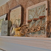
Old bikes and timeless painted antiques formed a unique but ever-flowing theme for their master retreat.  A gallery ledge above the timeless iron bed felt romantic indeed but certainly not to feminine for Ken 😉  Custom drapes by Judy Madej, truly made this space complete with sheers to adjust the light and mood anytime of day.  I love the corner tufted-back chair with the roses and vintage magazine rack.  The dresser from Simple Vintage, had so much charm and was such a perfect fit that I choose to paint the chest just like it.

Lauren’s room was feminine as they come as she choose a French chic theme.  Surrounded with white ruffles, vintage blush/rose and mirrored silver/gold pieces, her room was the perfect mix of vintage glam.  The velvet gray headboard and soft gray walls acted as a nice backdrop for this cooler palette.  Lauren’s chandelier fan just topped it off and completed the space.

Contrary to Lauren’s room….of course, you had Matthew’s rustic beach retreat.  His palette style headboard and paisley tan bedding instantly brings a masculine but grungy sailor look.  Deep navy striped pillows and bronze/brass accents, this bedroom is super welcoming for Matthew and guests alike.

Speaking about guests, Donna and Ken have already told me I could stay their for a weekend and just relax and not work!  I have to say I could truly take you up on that offer although I may end up cleaning or shifting a few things around a bit!

This family is so stink’n sweet!  I’m telling you, they were the easiest and most fun to work with.  They were FULLY trusting in my abilities and direction in each room.  I cannot express how humbling it is to be the one that creates a dream come true for them.  What a gift to be chosen to give them a retirement space…a new chapter…a new lifestyle.

“It’s more than décor”.  It’s everyday life….a weekend getaway.  It’s seeing Donna cry and hug me in disbelief as she walked into her completed space for the first time.

People work hard their whole life and to see when reality hits them that this retreat is truly their home brings me a joy I cannot describe.

I have a gift.  The Martin’s received a gift.  I’m doing exactly what I was put here to do and I thank God that He keeps orchestrating little miracles and asked me to play a small role.

Martin’s- I can’t wait to tackle your Deer Brook home next!


Riverdale – Phase 2

“The home is just not complete”, says Ernie White.  “Go ahead and do the additional 3 guest bedrooms, guest bath and front porch”.
Yipppeeee!  Amanda and I were on it with a quick but detailed plan to make the rest of the home just as amazing.
And amazing it was…..
  • Front Room or Room 1– two twin beds showcased a timeless layout with a French shabby cream dresser in between.  The beds, however, were mid-century in style bringing the combined general theme of this house, “shabby meets mid-century” full circle.  I choose a charcoal toile quilt for the beds but ignored the rules by putting a pop of mustard in the mix for fun.  The gallery wall reflected past travels and Amanda even found some old maps with all the shades.  If this were a choice in a bed and breakfast, it would certainly be my favorite pic.
  • The Middle Room or Room 2– was by far the smallest so I wanted to showcase yet another furniture layout; a daybed.  Amanda found a great charcoal one and we kept it super subtle and went with all white linens with hints of gold and gray/green as accents.  Soft birds and wispy sheers panels found their way in here too.  It was topped off by an old door used for hanging hats, scarves, you name it.  Or would you?  Name it your fav?
  • Back Room or Room 3– was a throw “back” in time.  Gosh it turned out so cozy, full of the time-worn textures of quilts and layers lined with delicate woods like the small high top dresser and cottage headboard.  Take your grandma’s old hankies and mix them with modern pops of orange and teals and then throw in some lace and ornate gold and you have this fabulous room!  So should we turn the sheets down for your stay?
Put on facebook, which room you would choose.  Everyone that post and tags “Kristina Kreations” gets entered into a drawing for a 2 hour FREE consultation!!!!!
Winner will be selected 2/28/15


Cindy Spear Remodel


If the walls of the Spear home could talk, they would shout not whisper.  This home has truly come full circle from raising 3 kids to now a peaceful sanctuary for Cindy Spear.  The Spears have lived a humble life in their Mulberry home, however, not much had changed in light of decor since the days of raising kids.  Cindy was still rockin out her 1970’s flat laminate cabinets and counters, blue plaid sofa and popcorn ceilings.  Her interior doors still had holes in them where the two brothers Josh and Aaron would wrestle and then flip the door around so mom and dad wouldn’t see.  Needless to say, those doors were replace by the none-other David Cochran Construction.   Along with new doors and hardware, Cochran facilitated a kitchen with new lighting, granite counters, painted & glazed cabinets and new appliances.  Her popcorn ceiling was replaced with a fresh knockdown texture and her wood paneling was filled in, textured and painted (who knew you could do that!)  We added canned lighting in the great room & kitchen as well as opened up an old drop tray ceiling…you know the kind with the old plastic grates.  Cindy had wood floors continue into the great room and all was re-sanded and stained to match the existing.

With the recent passing of her beloved husband, it was Cindy’s turn to have a space that was new; a style that was reflective of her personality and grace.  After digging into Cindy’s head a bit, I gave her a simple French chic look with pops of antiques and weathered treasures.  This helps bring out Cindy’s love for refurbished items all while keeping it surrounded by soft feminine charm.

It truly feels like a different home, but the same.  Cindy’s grandkids can feel comfortable and her grown kids can feel sophisticated.

I may be way off Cindy, but I can totally see you proudly sporting your apron in this new kitchen, the grandkids rolling around on your rug (even though it’s light); Laura and you grabbing the last casserole out of the oven and the whole family sitting down to a feast.

And the nights you are having a lovely dinner without the extras, just glance up at the “family” saying on your nook wall and rest in that confirmation.

Who would’ve thunk it……that I’d be given the privilege of doing this home of a family friend, mom of a high school friend (Laura) and resilient woman. 

Thanks Cindy.

Riverdale Model Home, Ernie White

From the dirt…to bed skirt; the ground…to profound!

The Riverdale is an expression of Ernie White at his best.  This home features a layout that’s conducive to any family.  With all the modern amenities, I chose to make this home feel extremely casual and young.

I chose a subtle but fresh color palette and blended mid-century modern, French country and shabby chic.  Magic happens when you think “outside the box” and blend unusual era’s together; they all were stunning in their time so why not bring the best elements out of each and throw them in a mixer 🙂

Even pops of industrial and Victorian can be seen but gosh how eloquently everything flows.  It really is a nice showcase of old meets new and how even new construction can look vintage and have that welcoming charm like a craftsman bungalow in downtown Lakeland.

Speaking of Lakeland, we really live in a great city.  It’s a simple or as vibrant as you want it to be, you just have to know these quaint and quirky little spots.  Same goes for shopping.

Some of my favorite spots and favorite people are: Dixieland Relics, Junk Prince, Black Swan and Simple Vintage.  It’s not only having such places as these close to home, but also having a relationship with small local businesses.  Nikki Hunt, Simple Vintage, answers my text directly with pictures.  Karen Dasher, Dixieland Relics, let’s me take 3 tablecloths to try and bring back the ones that don’t work.  How about my very own assistant, Amanda Bass, who thinks 3 levels outside that famous box and makes anything happen with paint or a computer!

I can’t say enough about Ernie White’s team who let me put my stamp on this house from the ground up.  They have NEVER boxed me in and I’m so thankful to work with this organized group of professionals.

Ernie is a timeless builder in Lakeland, but he is certainly changing with the times, approaching generations much younger than himself.  Love ya Ernie!!!

Let’s just say I was so happy with this house that I almost did the “riverdance” in the “riverdale”.  Well….maybe I did 🙂


Tish Family – Bowling Green

It’s simple, good-hearted folks like Allen and Cathy Tish that make me want to be better, live simpler and remember what’s really important.
Living the most humble lives in the middle of an orange grove in a home Allen built 35 years ago himself, they have raised their kids, sacrificed and saved.  Now, entering retirement, they can finally complete their home and have it feel as welcoming and warm as their personalities.
Cathy was open to anything.  She fully trusted me and Tim Wells when it came to cabinet design, busting out walls, colors and textiles.  I wanted to keep in line with her love for nature and art so it wasn’t any surprise that her hand-painted deer picture was my first inspiration.  I carried this deer with me everywhere and it truly started the whole theme.
Her kitchen was completely gutted and new wood farmhouse cabinets, granite counters and stone backsplash complimented the existing brick so nicely.  The Tish’s are all about family so turning their front living room into a HUGE dining room was perfect!  I had a 10′ plank table custom built by Tessa with “Vintage Woodworks” complete with 12 chairs.
Plaids with antiques; sunflowers with deer; this home is truly a stately lodge and Mrs. Tish will have you doing a craft or brewing some coffee for you if you enter her welcoming retreat.  Just don’t scratch her new wood floors!!
Allen and Cathy,
I hope you are delighted beyond measure as there are so many memories to be born in your same but new space.
Blessings to this super sweet family and Tim Wells for introducing us 🙂

Timeless Tradition- Larry & Heidi Edgy

We began updating the Edgy’s home in July 2014. An Ernie White home built in 1998, it was time for the floors, counters and wallpaper to change. Handscraped walnut floors were installed throughout and Cambria counters, travertine backsplash and new plumbing finished off their kitchen.

Larry and Heidi decided to keep going with their small renovations and allowed me to put the finishing touches using most of their existing furniture. Three weeks later they had a completed project and a welcoming home with new lighting, window treatments and all the fixins. Their admiration for Thomas Kincaid and existing formal cherry pieces, kept right in line with timeless tradition. They are a wonderful family with two teenagers, Brook and Josh. Movie nights nuzzled in the deep leather sofas, I can see your family having many years of memories in a comfy, rich and timeless home. Thanks to David Cochran and Amanda Bass for assisting on installation day.
We completed the day before Thanksgiving! Larry and Heidi- I hope your family feels so welcome and you feel so proud tomorrow on Thanksgiving Day. May our thanks be pleasing, graceful and rich, just like your home.